What happened?
I stopped visiting my own blog.
I'll explain. First of all...Emily's design brought a freshness and uniqueness my blog hasn't ever had. Making a change has nothing to do with the design work she kindly did for me.
I found that I was having to squint to see my own pictures and didn't have the flexibility to have words on either side of my photos because of the limited column width of a standard 3 column template. I post lots of pictures and I missed the creativity of placing them exactly where I want them in my posts.
Also, I've started using PhotoBucket to post larger images to my Photography site. This made me want a wider post area over here even more.
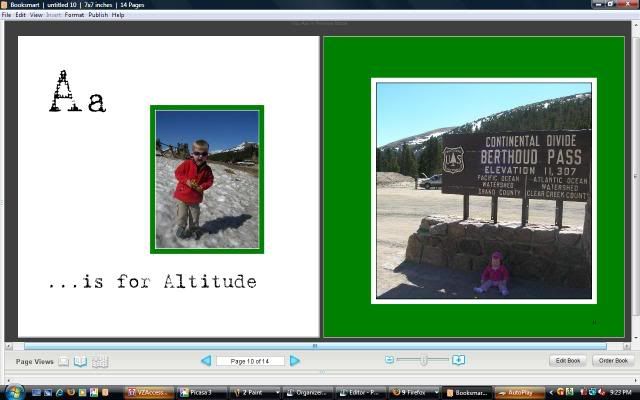
And the reason that trumps them all - My screenshots of my Alphabity Moments pages are too tiny. Isn't this nicer?
SO MUCH left to do tonight, but wanted to pop on to explain where everything went.
See you tomorrow for the letter B! Oh and if anyone can figure out the code for my Alphabity Button let me know...I thought I had it figured out but it keeps adding random characters next to the graphic.


3 comments:
I'm excited for letter B tomorrow- my post is up and ready to publish at 7am tomorrow. I'll try to pop in to Mr. Linky--can't wait to see yours!
WOW...it loads 10x faster too. I used to click on your blog, then go do a load of laundry, nurse, and cook lunch...then come back and it was up. Ok, ok, that is an exaggeration, but it did usually take awhile to pop up, and we have 'high speed' type internet!
I had a 3 column for a second too and went back to the good old 2 column for the same reasons.
Love those scrapbook shots! They're even better in the larger size :)
Post a Comment